12, 2014
Using LinkedIn for Sales: My UI suggestions to LinkedIn
Last night, I tweeted:
And received this response:
I consider myself a LinkedIn power user. I’m a Premium subscriber and keep LinkedIn open in my browser as part of my work flow – identifying customer development and sales prospects, researching people on a call invite I’ve never met, and connecting with new and old contacts to continually build my network. Spending this much time in any application reveals warts, and LinkedIn is a pretty hairy toad.
So okay, LinkedIn. Here are a few – not all – of the problems I have with your UI:
1. Why do you shut off third party API access? I mean, I know why you do it. And it’s stupid. I received this email from RelateIQ, my CRM, yesterday:
As a result of changes LinkedIn made to its API policies, however, we can no longer authenticate directly with your LinkedIn account. Going forward, this means LinkedIn contact profiles will be one click away from the platform through URLs. No action is needed from you—we just wanted to give you a heads up about the change.
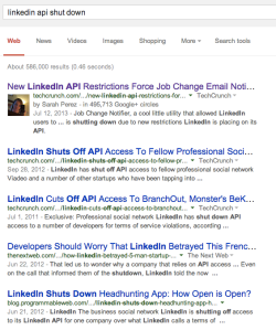
I just googled “linkedin api shut down.”
Silly. Just silly. You know that job change notification service you shut down? That’s how I got my current position at Blend Labs. I received one of these notices for our CEO when he updated his profile on starting the company. I thought – “Oh hey – I’ve haven’t talked to Nima in a while. I should ping him.” And I did. Three months later I was consulting for the company and now I’m the VP of Sales and Marketing. Pretty cool. Because of one simple, silly little email notification that you shut off. Thanks for that.
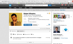
2. Why can I click the direct user page URL from a profile, especially if I’m connected to that person? I used the search box to find a contact and then clicked on the search result. See below. From this view, the URL is gobbly-gook. All I wanted to do is grab my contact’s personal LinkedIn URL to include in an email. Now I have click the “Contact Info” tab to find the contact’s personal URL. Ridiculous.
3. Why can’t “Reminders” be added to my top navigation bar? I started using the “Reminder” feature in the “Relationship” tab. The only place I’m reminding is buried at the bottom of my daily email feed from LinkedIn which I don’t get to everyday or simply forget to check:
4. If I am a successful InMailer, why can’t I get props for that? My InMail ratings are 5-star. I’ve sent out more than 50 InMails, and received responses for about 50%, with 100% of those responses giving me a 5-star rating. No joke. 100%. For the rest, a response wasn’t received and the InMails were returned to me.
If I’m that good on InMailing, why not give me credit? Think of it like NFL challenge flags. When coaches challenge two calls successfully, they get another challenge. If the goal of LinkedIn is to build networks, why not reward excellent networkers like me with more InMails.
Getting three (3) InMails per month is kind of crappy, with the next step to 10 Inmails or pay $10 per InMail. In most cases, I think $10 for a successful InMail is a really good deal all things considered. It just feels like you’re nickeling and diming me, or just pushing me up to the next subscription level.
5. Why is your Inbox pull-down UI so bad?
When I hover over my mailbox icon, a pull-down menu shows my messages. The UI is so sensitive that clicking over the person’s name sends me to the person’s profile. To read the message, I have to remember to click on the gray space to the right of the message listing, which also happens to be to the right of the “Delete” button. The UI doesn’t discern for me what action I will be taking based on where I place my pointer. This is just bad usability.
6. Why can’t I tag, sort, or archive LinkedIn emails categorically?
I’m doing some heavy outreach this week, setting up meetings at conference next week. As I’m pinging and emailing with people, my LinkedIn email inbox fills quickly and I can’t sort, tag, or otherwise categorize my emails. Instead I have to use “Search Inbox” to find emails. I’d like to tag emails and correspondence into buckets – i.e. by conference, by client type, by outreach method and source, etc. I can’t do that.
7. Why do you have two search boxes within the Inbox page? Do you know how many times I’m trying to search for a person by name in this top navigation bar only to get search results from my Inbox? So. Freaking. Frustrating.
8. Why can’t I search more naturally? For example, I searched “duke university fuqua 2002” and the results were not ordered or relevant except for the very first result who was a classmate and a first-level connection. I have 10+ first-level connections from my MBA cohort in my Contacts. Why is only one shown and the rest of the search results garbage?
9. Why does the page reset after viewing a profile on “People You May Know?” If I take a few minutes to scroll through your suggestions and then click on a profile, when I go back to the “People You May Know” page, I have to start all over at the top of the page. I may have been scrolling down for several minutes before clicking on an individual profile. Blech.
So there are nine ideas for you. That’s all I’ve got time to do. Time to get to work. And spend a couple of hours in LinkedIn.


